Code
cabi_ts = ts(cabi$count, start = 2015, frequency = 365.25)
fig = autoplot(cabi_ts, ts.geom = "line", main = "Capital Bikeshare Time Series", xlab = "Date", ylab = "Number of Rides")
fig+theme_bw()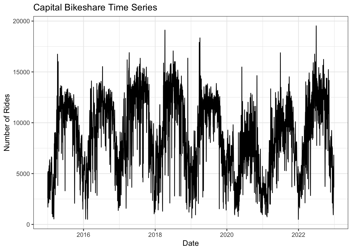
The time series of daily capital bikeshare users shows a clear seasonality with summer days having more rides than winter days, meaning that the times series has yearly seasonality. There is no clear upwards or downwards trend. The number of rides taken per day stays consistent year over year before the pandemic. In 2020 there is a significant drop in the number of rides taken per day leading to an increasing trend over the previous three years. The seasonal component appears to be additive, as there is no significant difference in the variance of the seasonal component year over year. It could be argued that the seasonal component is multiplicative after the pandemic.
This plot shows the decomposition of the time series for capital bikeshare ridership. It supports the previous finding that until the pandemic the overall trend was nearly constant, the pandemic then caused a big decline followed by a significant upwards trend. The plot also shows the clear year over year seasonal component. Finally there is still significant remainder after the removal of the seasonal component.
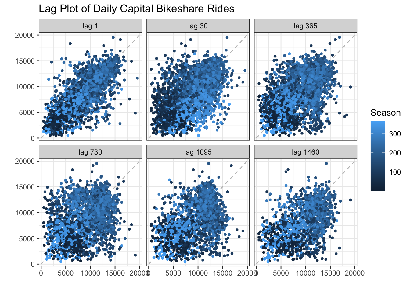
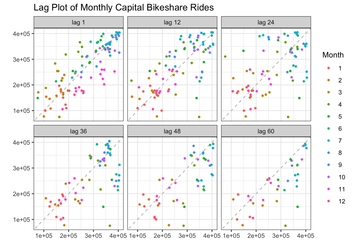
The lag plot for the capital bikeshare data does not reveal lots of new information. We assume the time series to have yearly seasonality but this cannot be confirmed by the use of the lag plots at 1 year increments. This is likely because there is so much variation in the number of rides on an individual day that 2 days 1 year apart are not likely to be highly correlated. Therefore, to better visualize this seasonal component we can show the lag plot of total monthly riders of capital bikeshare. The lag plot shows 1 month and yearly increments which are all positively correlated indicating that there is yearly seasonality.
The acf plot of capital bikeshare ridership clearly shows a strong correlation at lags 1,2,3 years and a strong negative correlation at the 6 month intervals between those. This means that the data is not stationary. The Pacf plot indicates that this data can be used for a auto regressive model as it tails off.
The p-value is less than 0.05 indicating that we can reject the null hypothesis and assume the data is stationary.
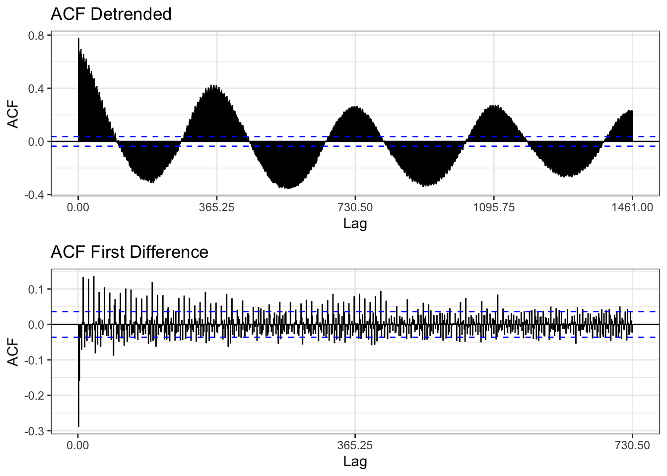
The two methods employed to make the data stationary are De-trending (using regression) and first differencing. In the first plot you can see the new time series after de-trending and differencing. Clearly the first difference plot looks more random while the de-trended plot still shows clear seasonality. This is supported by the ACF plots which for the de-trended series still shows high correlation at 1 year intervals, while the first differenced series shows much higher randomness at which lags are correlated indicating the the series is likely stationary.
fit = lm(cabi_ts~time(cabi_ts), na.action = NULL)
plot1 = autoplot(resid(fit), main = "Detrended Capital Bikeshare Timeseries")+theme_bw()
plot2 = autoplot(diff(cabi_ts, differences =1), main = "First Difference Capital Bikeshare Time Series", ylab = "First Difference", xlab = "Date")+theme_bw()
grid.arrange(plot1, plot2, nrow = 2)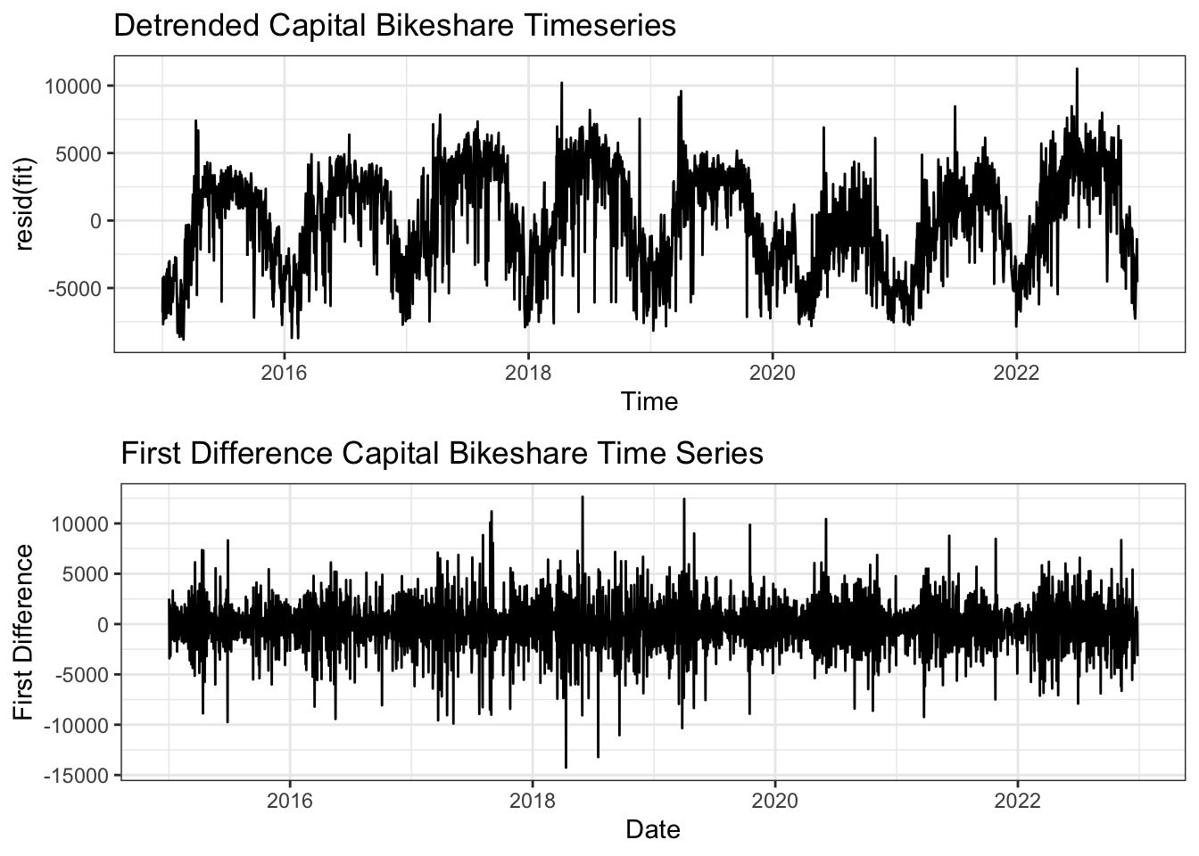
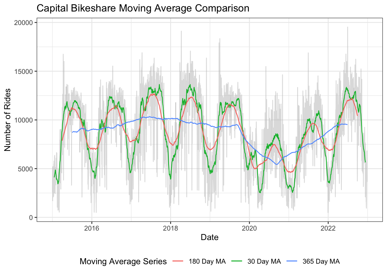
Three moving average lines are shown on the plot: 30 Day, 180 Day, and 365 Day. The 30 day moving average (green) follows the general data fairly closely and essentially plots a monthly average, which exhibits seasonality while still showing the variation that occurs in the data. The 180 day moving average (red) is a far smoother version of the 30 day, it still shows the seasonality in the data but much of the variance is removed. Finally the 365 day moving average (blue) shows no seasonality or day to day variance and only follows the overall trend of the data. As you can see the overall trend is fairly constant from 2015 to 2020, followed by a dip due to the pandemic and a recovery climb post 2020 back to normal levels.
ma_30 = ma(cabi_ts, 30)
ma_180 = ma(cabi_ts, 180)
ma_365 = ma(cabi_ts, 365)

autoplot(cabi_ts, color = "gray", alpha = 0.5) +
  autolayer(ma_30, series = "30 Day MA")+
  autolayer(ma_180, series = "180 Day MA")+
  autolayer(ma_365, series = "365 Day MA")+
  labs(
    title = "Capital Bikeshare Moving Average Comparison",
    x = "Date",
    y = "Number of Rides",
    color = "Moving Average Series"
  )+
  theme_bw()+
  theme(
    legend.position = "bottom"
  )
This is a time series plot showing the number of rides taken on metro rail each month between 2011 and 2022. Before the covid-19 pandemic the series had clear seasonality with warmer months having higher ridership totals than cooler months. In addition the time series also had a slight downwards trend between 2011 and 2020. The seasonal components are additive here as there are no significant changes in the variation of the seasonal affect over time. In March of 2020 there is a significant decrease in ridership due to the pandemic. Post pandemic we see a significant upwards trend in ridership along with a seasonal affect that appears to be multiplicative, however with so few years occurring in the post pandemic period it is hard to confirm what type of seasonal affect the time series has.
This plot shows the decomposition of the time series for metro rail ridership. It supports the previous finding that until the pandemic the overall trend was slighlty downwards, the pandemic then caused a big decline followed by an upwards trend. The plot also shows the clear year over year seasonal component. Finally, the remainder indicates that for the most part the seasonal and trend components explain all of the data, however right around the 2020 pandemic there is still unexplained behavior in the data.
This plot shows the lag plots of metro rail at 1 month, 1 year, 2 year, and 3 year lags. The data is highly correlated at 1 month lag and relatively highly correlated at 1 year lag. At successive year lags the data becomes much less correlated. This indicates that we likely have yearly seasonality but the correlation between years decreases as the years get further apart.
The metro rail acf plot shows strong correlation with lags between 1 month and 27 months. After that the correlation tails off. This indicates that the data is not stationary because there is seasonality. The pacf plot tails off after the first lag indicating that an autoregressive model would be a good choice for modelling this data.
The p-value is greater than 0.05, therefore we cannot reject the null hypothesis that this data is not stationary.
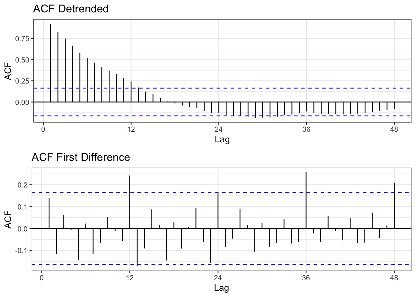
The two methods employed to make the data stationary are De-trending (using regression) and first differencing. In the first plot you can see the new time series after de-trending and differencing. Clearly the first difference plot looks more random while the de-trended plot still shows clear seasonality and trend. This is supported by the ACF plots which for the de-trended series still shows high correlation for multiple month lags while the first differenced series shows much higher randomness at which lags are correlated indicating the the series is likely stationary.
fit = lm(metro_ts~time(metro_ts), na.action = NULL)
plot1 = autoplot(resid(fit), main = "Detrended Metro Rail Timeseries")+theme_bw()
plot2 = autoplot(diff(metro_ts, differences =1), main = "First Difference Metro Rail Time Series", ylab = "First Difference", xlab = "Date")+theme_bw()
grid.arrange(plot1, plot2, nrow = 2)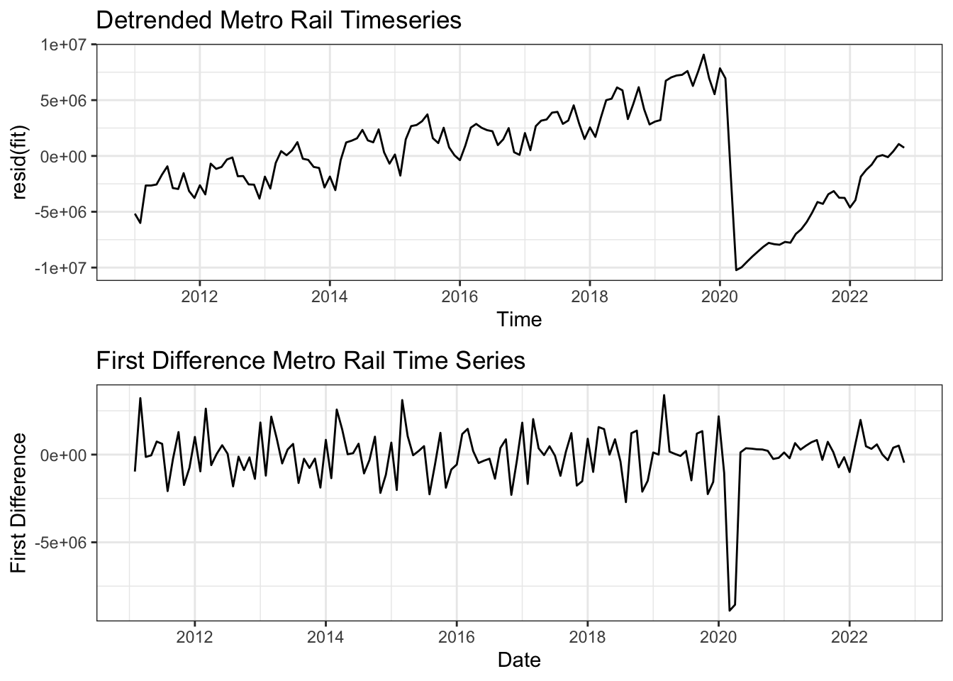
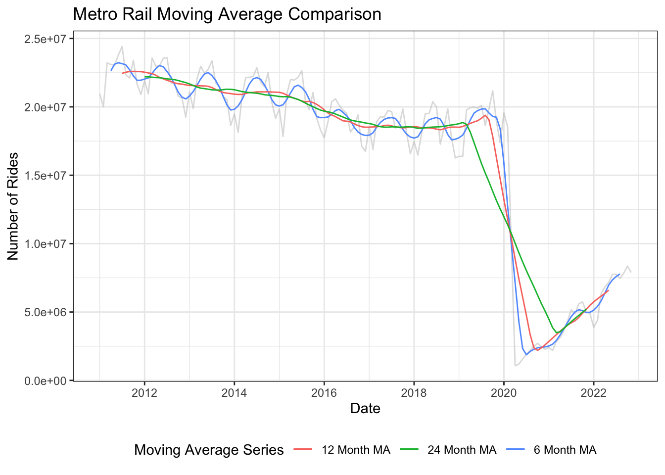
The three moving average lines plotted are 6 month (Blue), 12 month (Red), and 24 month (Green). The 6 month moving average shows the seasonal aspect of the data with less variation than the original time series. The 12 month moving average shows the overall trend without the seasonality, which exhibits a steady decrease from 2011 to 2020 followed by a sharp drop a subsequent recovery in 2020 due to the pandemic. The 24 month moving average shows the same as the 12 month line, though it is less impacted by the significant drop in 2020.
ma_6 = ma(metro_ts, 6)
ma_12 = ma(metro_ts, 12)
ma_24 = ma(metro_ts, 24)

autoplot(metro_ts, color = "gray", alpha = 0.5) +
  autolayer(ma_6, series = "6 Month MA")+
  autolayer(ma_12, series = "12 Month MA")+
  autolayer(ma_24, series = "24 Month MA")+
  labs(
    title = "Metro Rail Moving Average Comparison",
    x = "Date",
    y = "Number of Rides",
    color = "Moving Average Series"
  )+
  theme_bw()+
  theme(
    legend.position = "bottom"
  )
This is a time series plot showing the number of rides taken on metro bus each month between 2011 and 2022. Before the covid-19 pandemic the series had clear seasonality with warmer months having higher ridership totals than cooler months. In addition the time series also had a slight downwards trend between 2011 and 2020. The seasonal components are additive here as there are no significant changes in the variation of the seasonal affect over time. In March of 2020 there is a significant decrease in ridership due to the pandemic. Post pandemic we see a significant upwards trend in ridership along with a seasonal affect that appears to be multiplicative, however with so few years occurring in the post pandemic period it is hard to confirm what type of seasonal affect the time series has.
This plot shows the decomposition of the time series for metro bus ridership. It supports the previous finding that until the pandemic the overall trend was slighlty downwards, the pandemic then caused a big decline followed by an upwards trend. The plot also shows the clear year over year seasonal component. Finally, the remainder indicates that for the most part the seasonal and trend components explain all of the data, however right around the 2020 pandemic there is still unexplained behavior in the data.
This plot shows the lag plots of metro bus ridership at 1 month, 1 year, 2 year, and 3 year lags. The data is highly correlated at 1 month lag and relatively highly correlated at 1 year lag. At successive year lags the data becomes much less correlated. This indicates that we likely have yearly seasonality but the correlation between years decreases as the years get further apart.
The metro bus acf plot shows strong correlation with lags between 1 month and 28 months. After that the correlation tails off. This indicates that the data is not stationary because there is correlation between the lags. The pacf plot tails off after the first lag indicating that an auto regressive model would be a good choice for modelling this data.
The p-value is greater than 0.05 so we cannot reject the null hypothesis that the data is non-stationary.
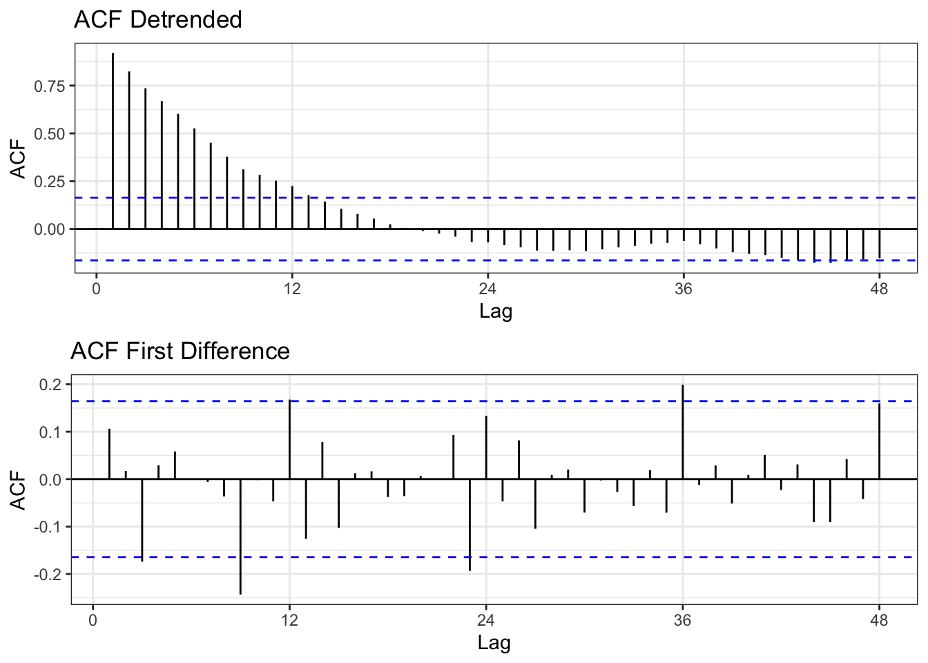
The two methods employed to make the data stationary are De-trending (using regression) and first differencing. In the first plot you can see the new time series after de-trending and differencing. Clearly the first difference plot looks more random while the de-trended plot still shows clear seasonality and trend. This is supported by the ACF plots which for the de-trended series still shows high correlation for multiple month lags while the first differenced series shows much higher randomness at which lags are correlated indicating the the series is likely stationary.
fit = lm(bus_ts~time(bus_ts), na.action = NULL)
plot1 = autoplot(resid(fit), main = "Detrended Metro Bus Timeseries")+theme_bw()
plot2 = autoplot(diff(bus_ts, differences =1), main = "First Difference Metro Bus Time Series", ylab = "First Difference", xlab = "Date")+theme_bw()
grid.arrange(plot1, plot2, nrow = 2)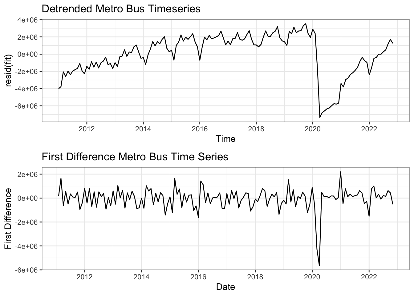
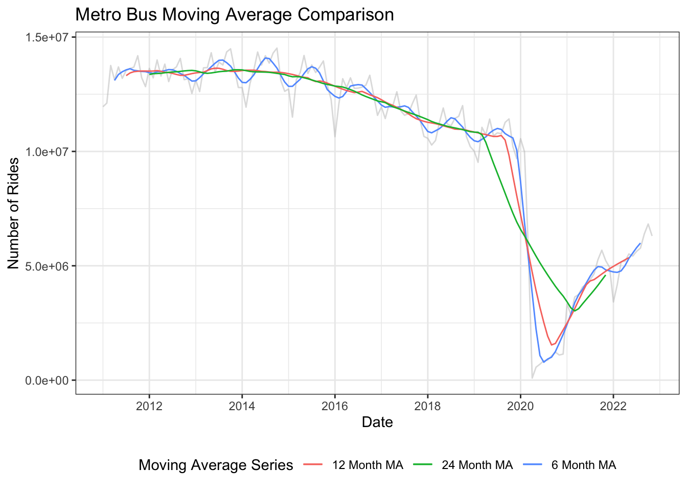
The three moving average lines plotted are 6 month (Blue), 12 month (Red), and 24 month (Green). The 6 month moving average shows the seasonal aspect of the data with less variation than the original time series. The 12 month moving average shows the overall trend without the seasonality, which exhibits a steady decrease from 2011 to 2020 followed by a sharp drop a subsequent recovery in 2020 due to the pandemic. The 24 month moving average shows the same as the 12 month line, though it is less impacted by the significant drop in 2020.
ma_6 = ma(bus_ts, 6)
ma_12 = ma(bus_ts, 12)
ma_24 = ma(bus_ts, 24)

autoplot(bus_ts, color = "gray", alpha = 0.5) +
  autolayer(ma_6, series = "6 Month MA")+
  autolayer(ma_12, series = "12 Month MA")+
  autolayer(ma_24, series = "24 Month MA")+
  labs(
    title = "Metro Bus Moving Average Comparison",
    x = "Date",
    y = "Number of Rides",
    color = "Moving Average Series"
  )+
  theme_bw()+
  theme(
    legend.position = "bottom"
  )